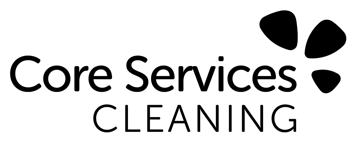
Logo Design & Application
"Quiff & Ginger were amazing to work with. They understood the design brief perfectly and were easy to contact if I needed them. Would definitely use again!"
The Brief
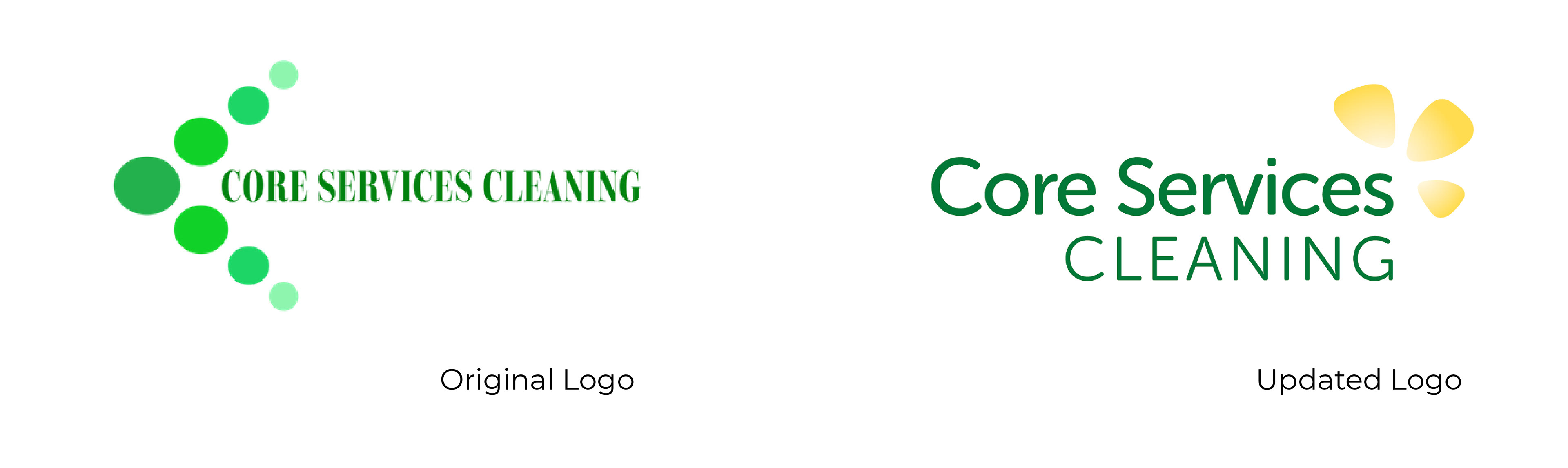
Core Services Cleaning is a corporate cleaning company specialising in eco friendly solutions. Having recently had a website upgrade they were keen to update their logo to complete their new look. They weren't looking for a radical change, and wanted to keep the same green colour scheme to mach their new website.
The Process
I began by researching the companies competition - so I could avoid existing imagery and be sure to stand out. Following that, I prepared 3 different rough versions to present to the client, to help us discuss options and narrow down our choices.
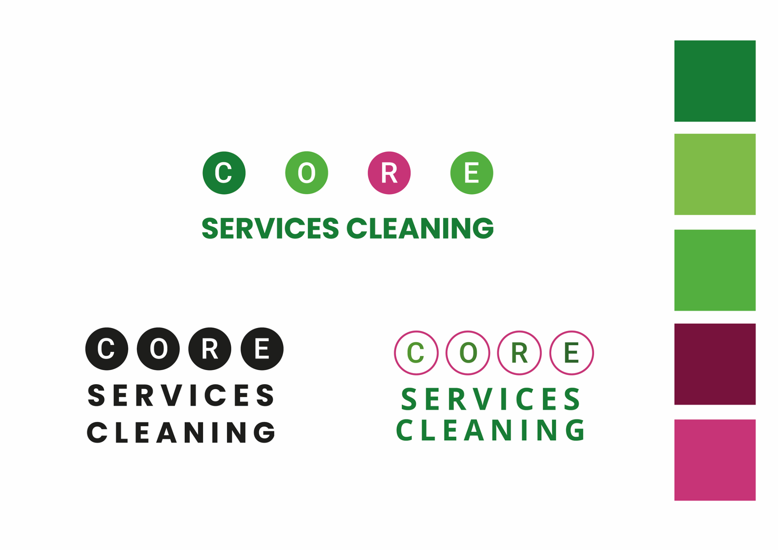
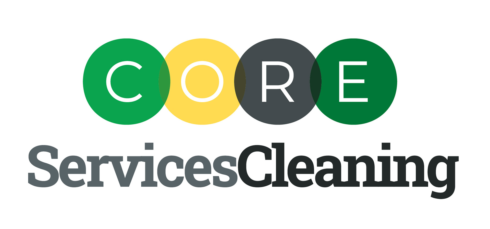
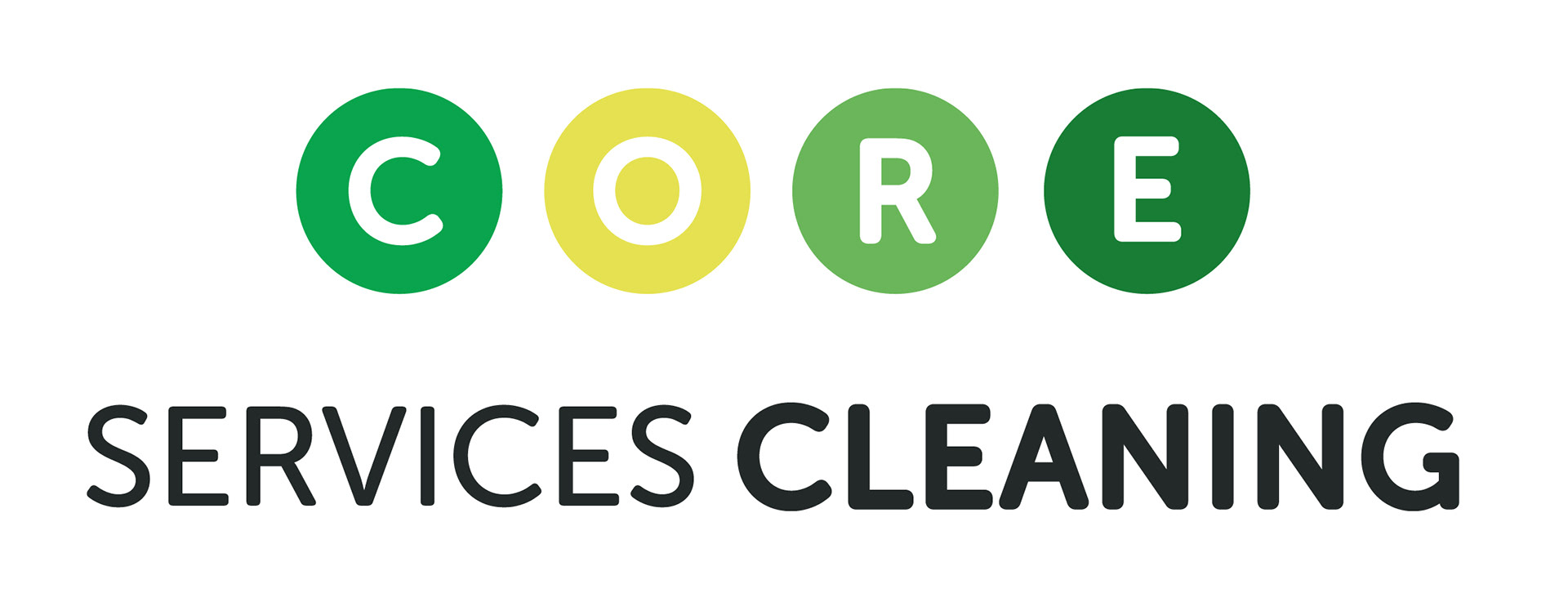
From this initial discussion the client preferred the cleaner, simpler design with the circles, however disliked the pink - and asked to replace it with a different accent colour.
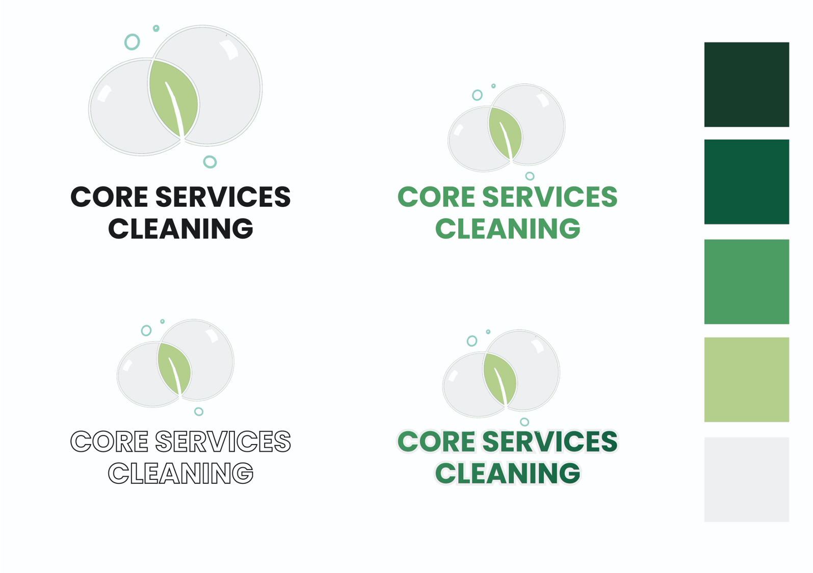
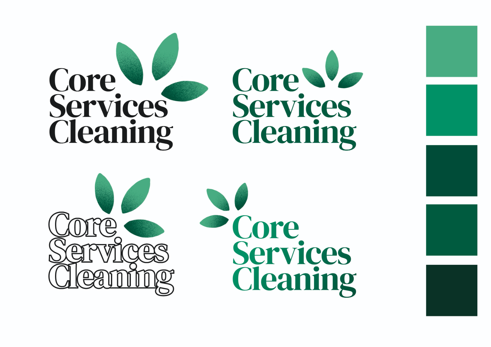
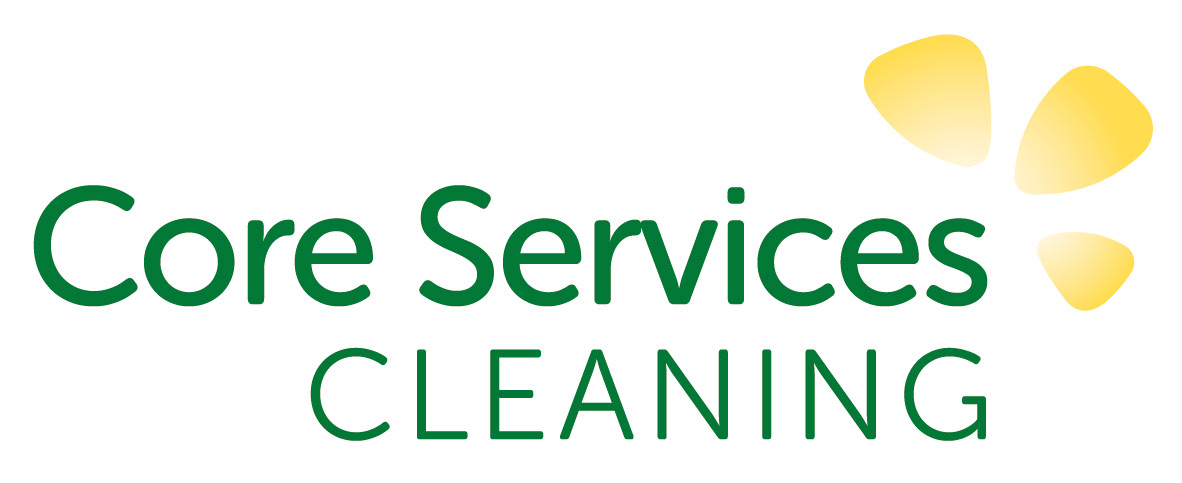
I decided to work on the circular design - and also develop the petal design - as I wondered if the client would prefer it once it had been refined.
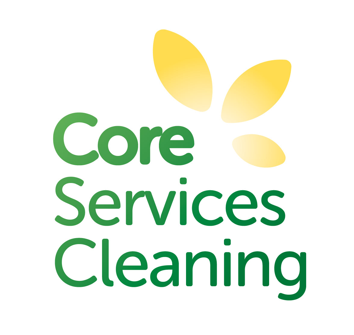
From this selection, the client did prefer the 'petal' design, and liked the accent colour of yellow as it gave a fresh and natural feel to the branding.
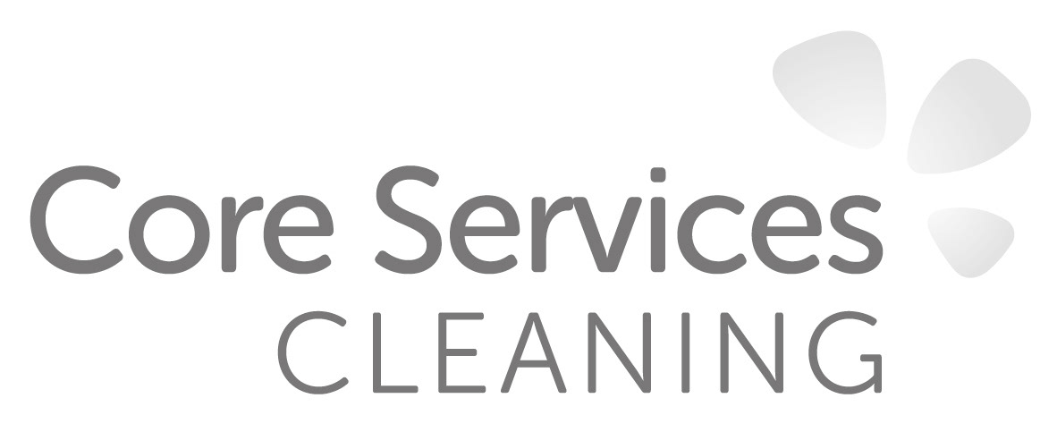
The Outcome
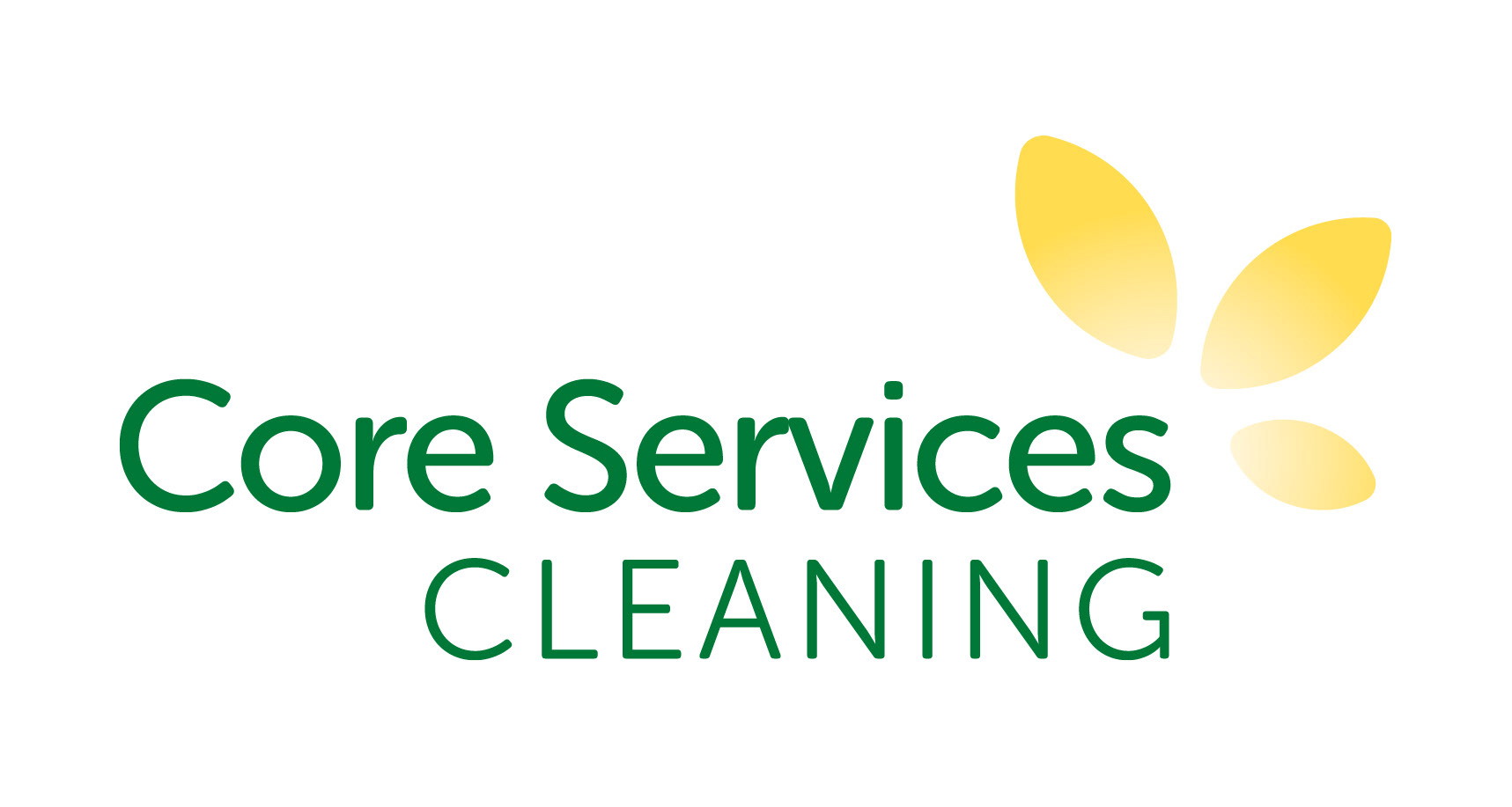
For the final version of the logo I softened the angles on the petals - and the result communicates an idea of nature as either a buttercup or a sunbeam - which matches the brand values of the company. I also like that the colour scheme includes a lemon yellow - an ingredient common in eco friendly cleaners.
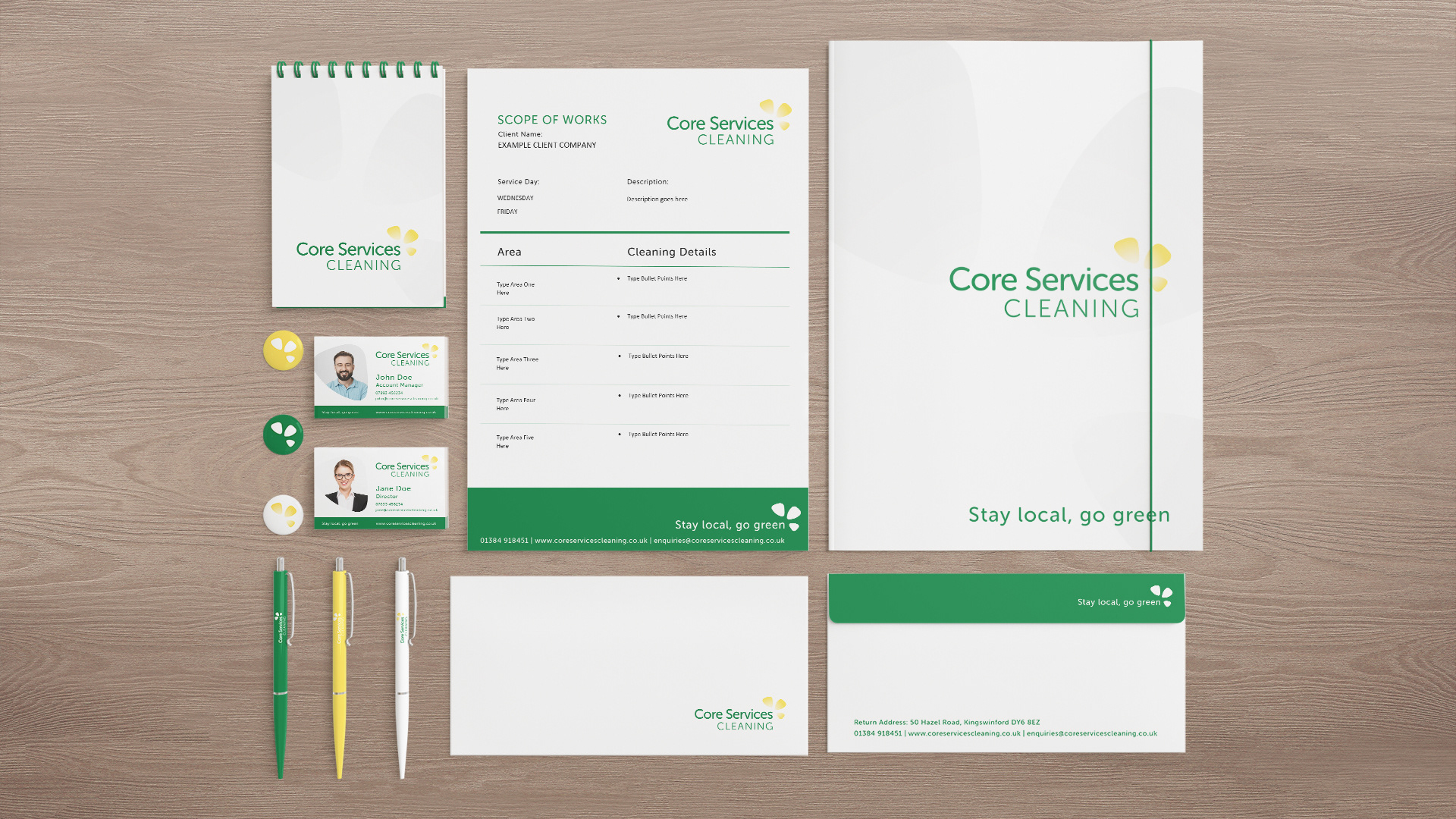
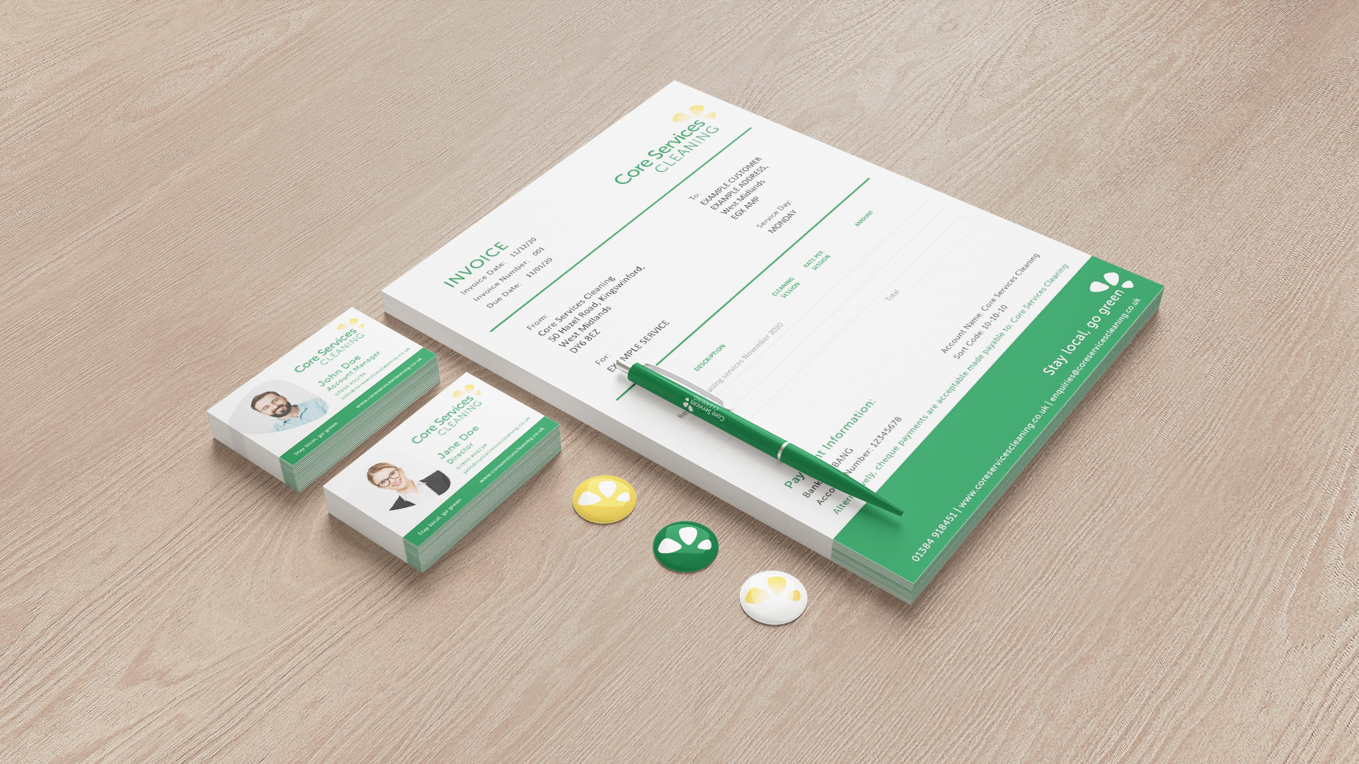
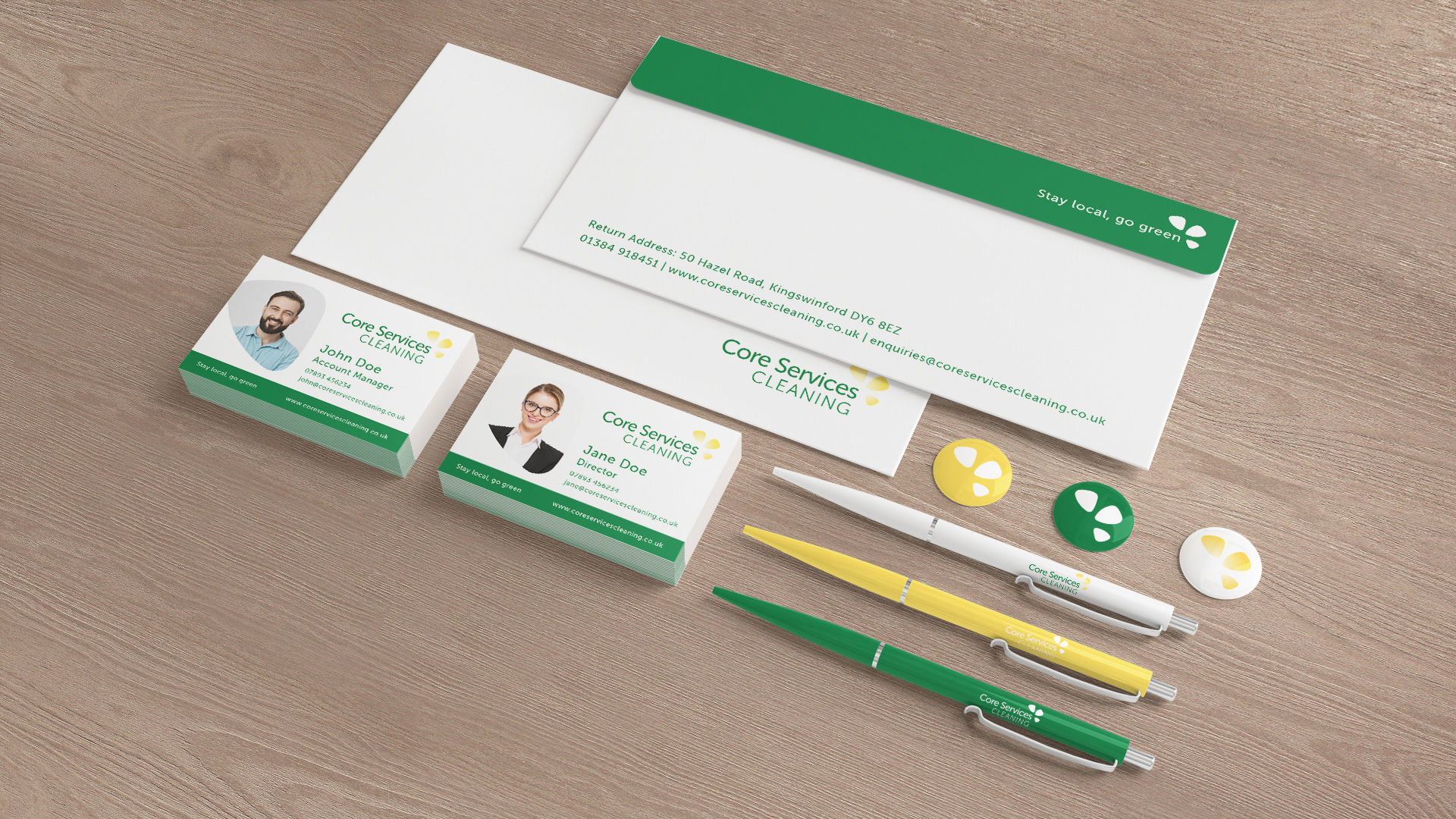
The Logo was then applied to custom designed invoices and scope of works designed - as well as an introductory pdf for their new clients.