Music Festival Branding
The Brief
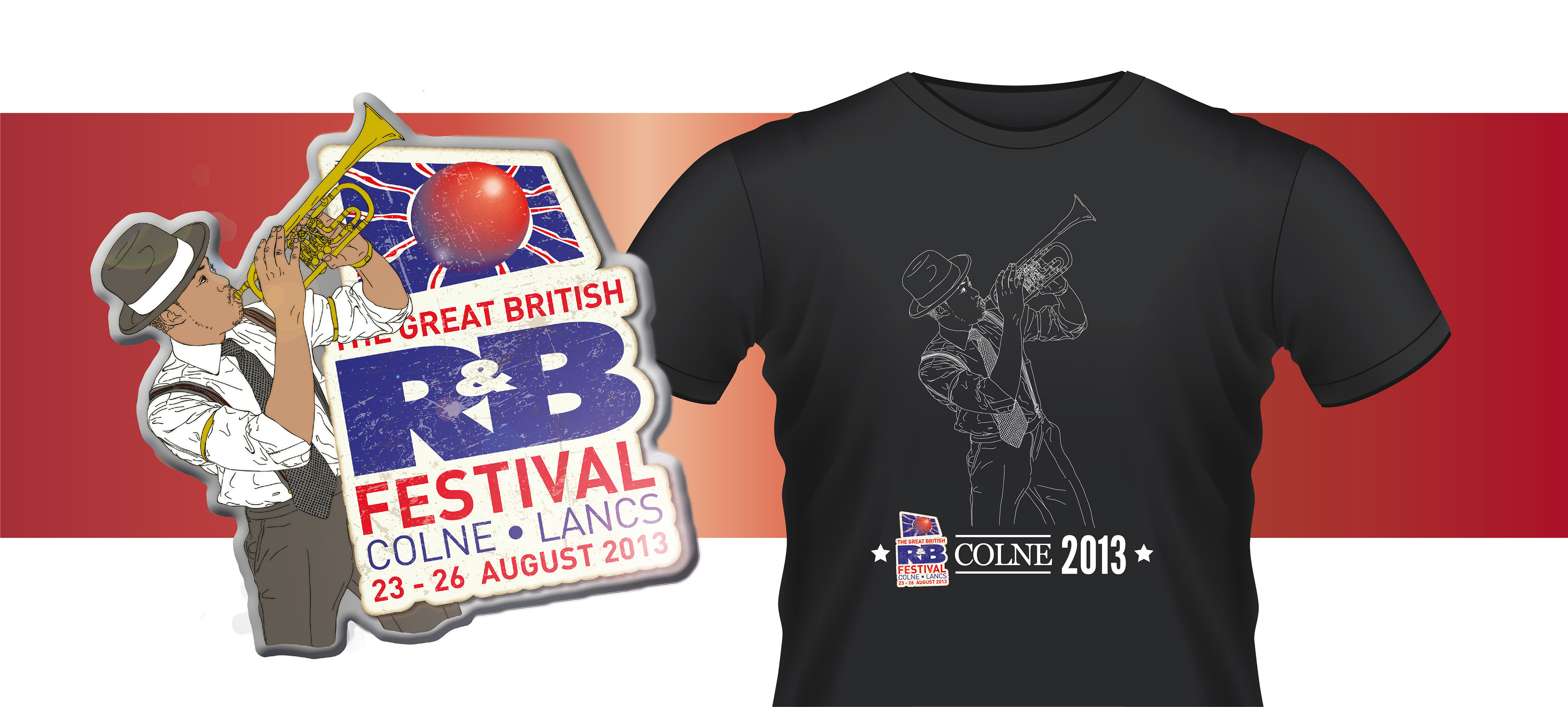
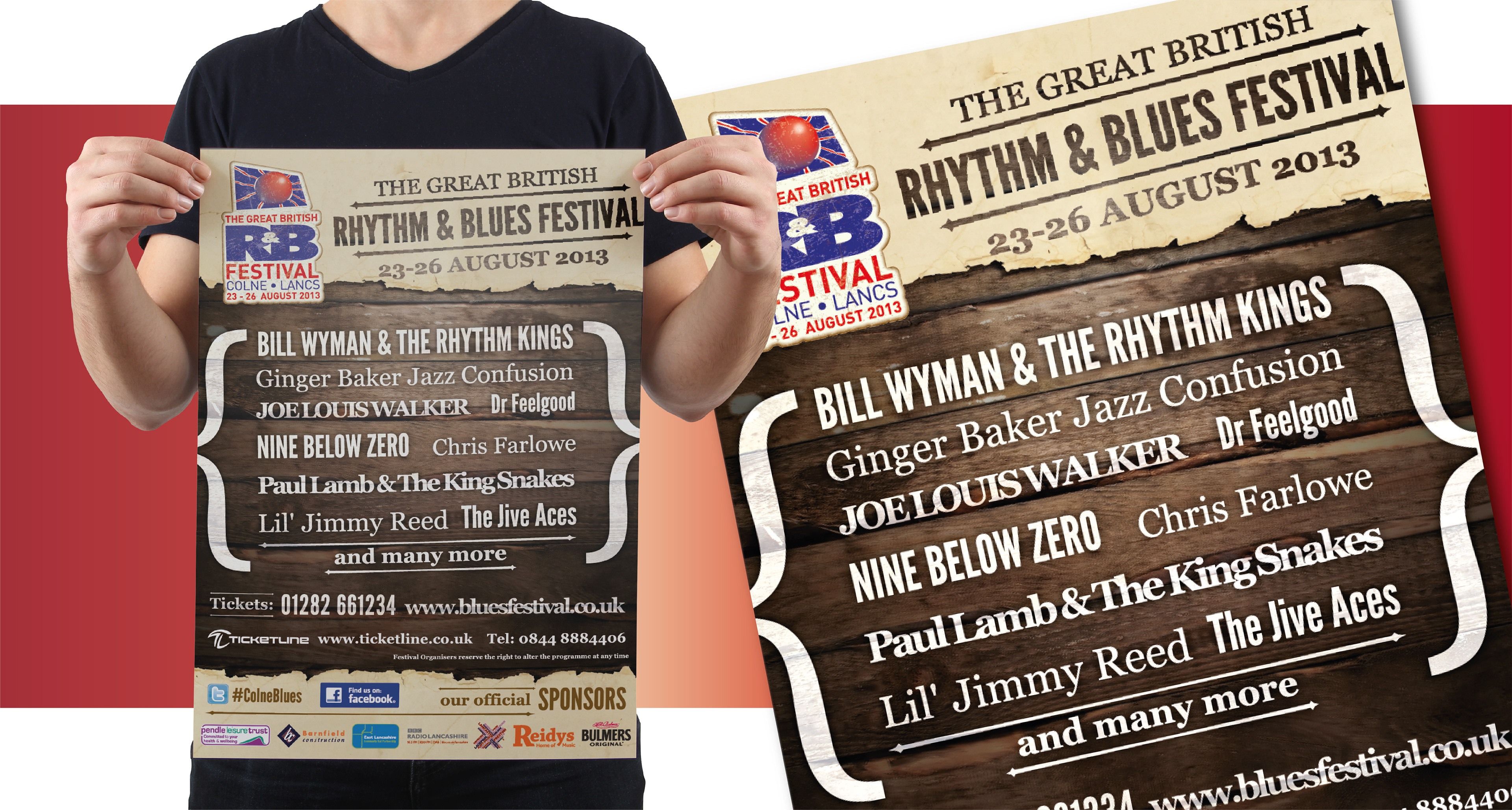
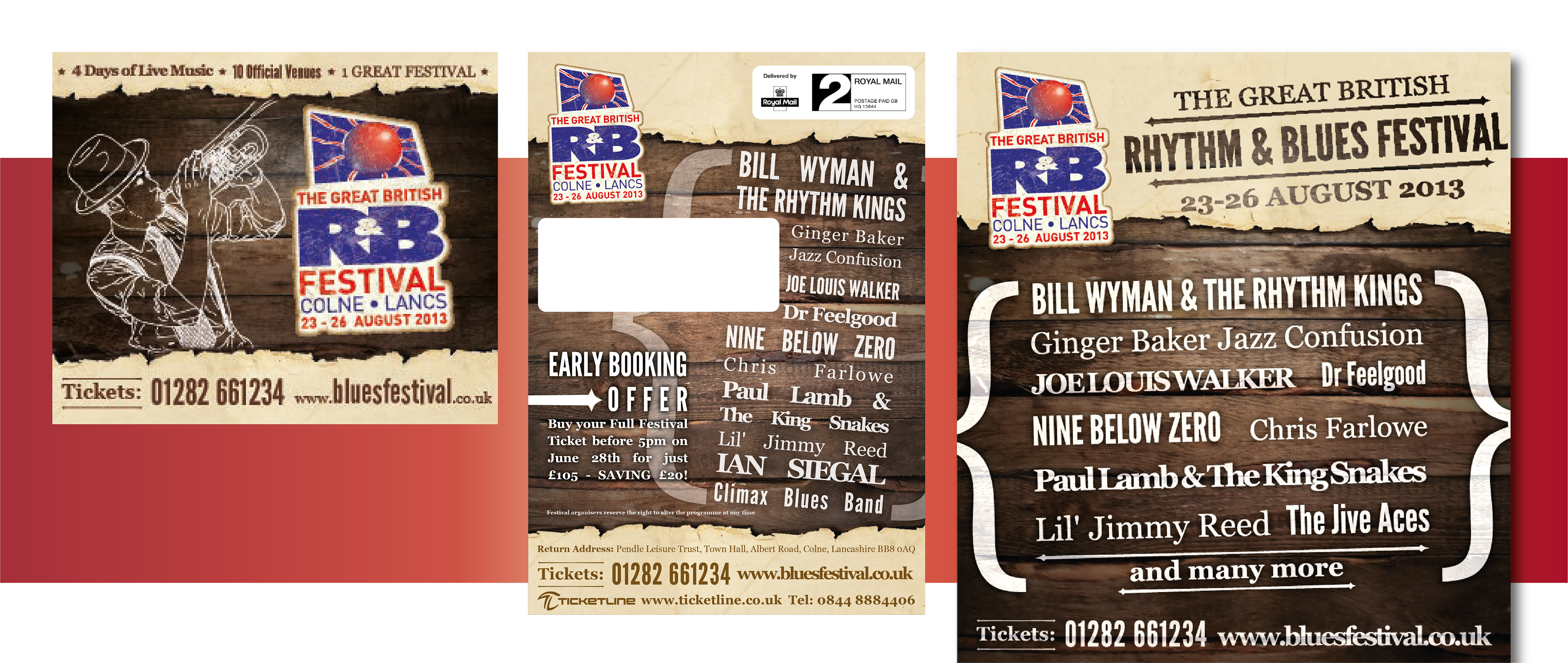
The Great British Rhythm & Blues Festival was hosting its 24th annual event, and wanted fresh branding to theme its posters, marketing and merchandise. One of the challenges was that as it was a long running event, there had already been many different looks for the festival - so I needed to think of a new and fresh look that stood apart from previous years. To make things even more difficult, the first advertisement for the festival - and therefore the debut of the branding - was being placed in a magazine long before any of the artists were finalised. This meant that the look of the marketing could not feature images of the artists set to play at the festival.
The Solution
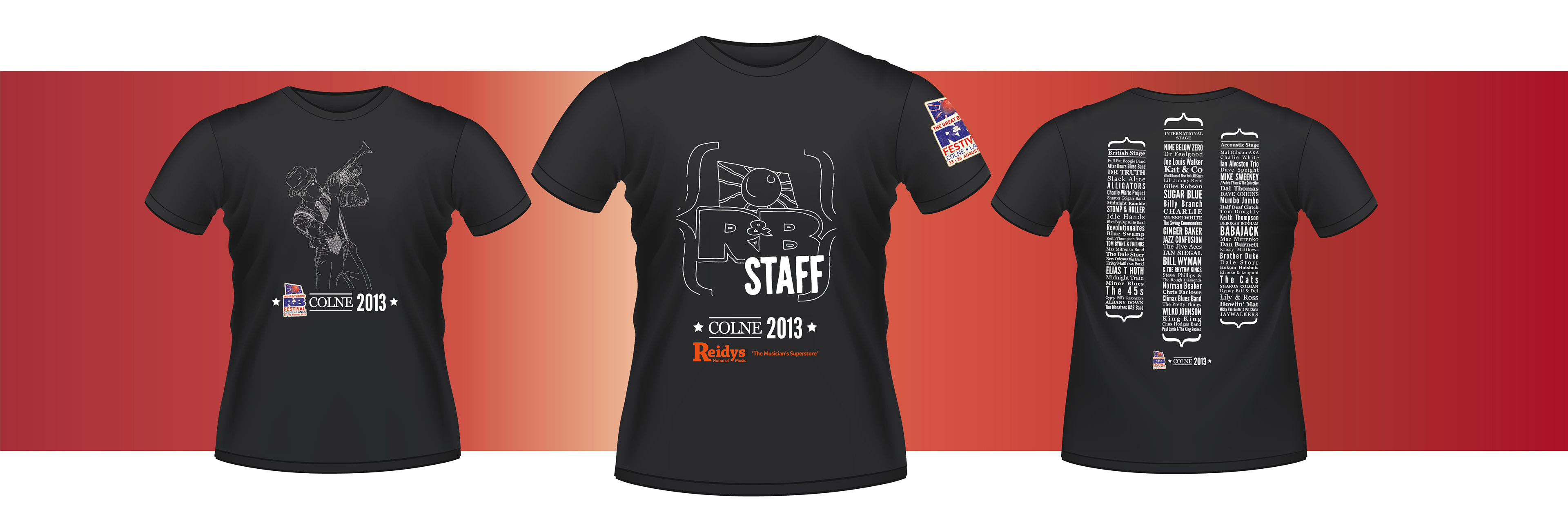
I decided to focus more on textures and typography for the branding of the festival, reflecting the origins of Rhythm & Blues and the nature of the artists and venues through old style wood and torn paper textures. I created an illustration of a New Orleans style trumpet player, and this was used as in both the advertising and merchandise, forming the design of a limited edition collectors pin badge.
Many of the long-time festival goers commented on the branding for the 2013 festival as 'The Best Ever'.